
sklearn_evaluation.plot#
The Plot API supports both functional and object-oriented (OOP) interfaces. While the functional API allows you to quickly generate out-of-the-box plots and is the easiest to get started with, the OOP API offers more flexibility to compare models using a simple synatx, i.e, plot1 + plot2; or to customize the style and elements in the plot.
Object Oriented API#
ConfusionMatrix#
- class sklearn_evaluation.plot.ConfusionMatrix(cm, *, target_names=None, normalize=False, cmap=None)#
Plot confusion matrix.
See also
Examples
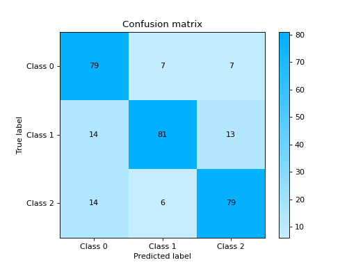
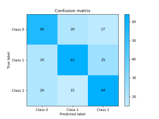
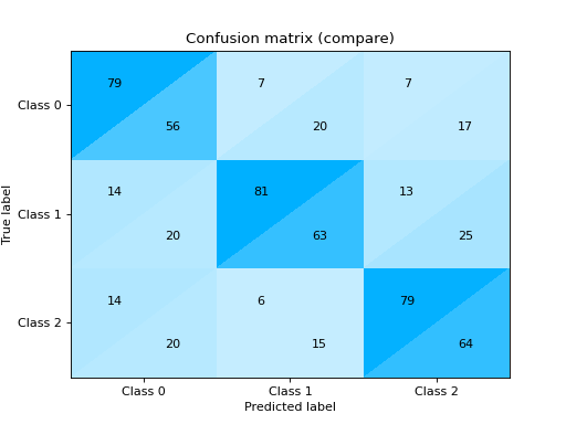
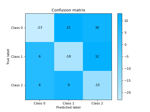
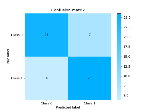
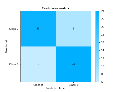
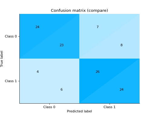
Plot and Compare Confusion Matrix for multiple classifiers:
from sklearn import datasets
from sklearn.ensemble import RandomForestClassifier
from sklearn.tree import DecisionTreeClassifier
from sklearn.model_selection import train_test_split

from sklearn_evaluation import plot

# generate data
X, y = datasets.make_classification(
    1000, 20, n_informative=10, class_sep=0.80, n_classes=3, random_state=0
)

# split data into train and test
X_train, X_test, y_train, y_test = train_test_split(X, y, test_size=0.3)

est = RandomForestClassifier()
est.fit(X_train, y_train)
y_pred = est.predict(X_test)

# plot for classifier 1
tree_cm = plot.ConfusionMatrix.from_raw_data(y_test, y_pred)

est = DecisionTreeClassifier()
est.fit(X_train, y_train)
y_pred = est.predict(X_test)

# plot for classifier 2
forest_cm = plot.ConfusionMatrix.from_raw_data(y_test, y_pred)

# Compare
tree_cm + forest_cm

# Diff
forest_cm - tree_cm
Notes
Changed in version 0.9: Added
cmapargument- classmethod from_dump(path)#
Instantiates a plot object from a path to a JSON file. A default implementation is provided, but you might override it.
- classmethod from_raw_data(y_true, y_pred, target_names=None, normalize=False, cmap=None)#
Notes
Changed in version 0.9: Added
cmapargument.
- plot(ax=None)#
All plotting related code must be here with one optional argument
ax=None. Must assign,self.ax_, andself.figure_attributes and returnself.
InteractiveConfusionMatrix#
- class sklearn_evaluation.plot.InteractiveConfusionMatrix(cm, *, target_names=None, interactive_data=None)#
Plot interactive confusion matrix.
Notes
New in version 0.11.3.
- classmethod from_dump(path)#
Instantiates a plot object from a path to a JSON file. A default implementation is provided, but you might override it.
- classmethod from_raw_data(y_true, y_pred, X_test=None, feature_names=None, feature_subset=None, nsample=5, target_names=None, normalize=False)#
Plot confusion matrix.
See also
- Parameters
y_true (array-like, shape = [n_samples]) – Correct target values (ground truth).
y_pred (array-like, shape = [n_samples]) – Target predicted classes (estimator predictions).
X_test (array-like, shape = [n_samples, n_features], optional) – Defaults to None. If X_test is passed interactive data is displayed upon clicking on each quadrant of the confusion matrix.
feature_names (list of feature names, optional) – feature_names can be passed if X_test passed is a numpy array. If not passed, feature names are generated like [Feature 0, Feature 1, .. , Feature N]
feature_subset (list of features, optional) – subset of features to display in the tables. If not passed first 5 columns are selected.
nsample (int, optional) – Defaults to 5. Number of sample observations to display in the interactive table if X_test is passed.
target_names (list) – List containing the names of the target classes. List must be in order e.g.
['Label for class 0', 'Label for class 1']. IfNone, generic labels will be generated e.g.['Class 0', 'Class 1']normalize (bool) – Normalize the confusion matrix
Examples
Click here to see the user guide.
- plot()#
All plotting related code must be here with one optional argument
ax=None. Must assign,self.ax_, andself.figure_attributes and returnself.
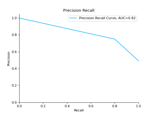
PrecisionRecall#
- class sklearn_evaluation.plot.PrecisionRecall(precision, recall, label=None)#
Plot precision recall curve.
- Parameters
precision (array-like, shape = [n_samples], when task is binary classification,) – or shape = [n_classes, n_samples], when task is multiclass classification.
recall (array-like, shape = [n_samples], when task is binary classification.) – or shape = [n_classes, n_samples], when task is multiclass classification.
label (string when task is binary classification, optional) – list of strings when task is multiclass classification this is used for labelling the curves. Defaults to precision recall. Make sure that the order of the labels corresponds to the order in which recall/precision arrays are passed to the constructor.
ax (matplotlib Axes) – Axes object to draw the plot onto, otherwise uses current Axes
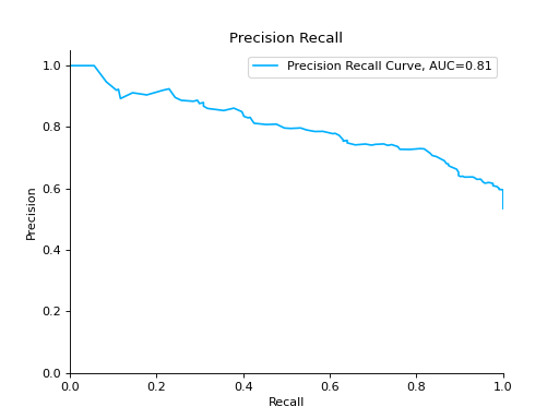
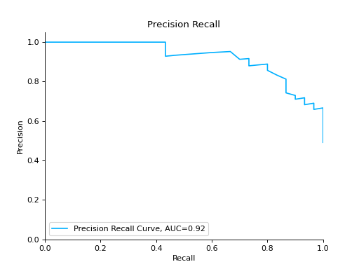
Examples
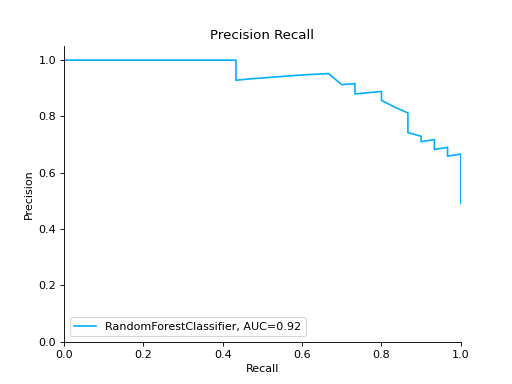
Plot a Precision-Recall Curve:
from sklearn import datasets
from sklearn.ensemble import RandomForestClassifier
from sklearn.model_selection import train_test_split

from sklearn_evaluation import plot

# generate data
X, y = datasets.make_classification(
    n_samples=2000, n_features=6, n_informative=4, class_sep=0.1
)

# split data into train and test
X_train, X_test, y_train, y_test = train_test_split(X, y, test_size=0.2)

est = RandomForestClassifier()
est.fit(X_train, y_train)

# y_pred = est.predict(X_test)
y_score = est.predict_proba(X_test)
y_true = y_test

# plot precision recall curve
pr = plot.PrecisionRecall.from_raw_data(y_true, y_score)
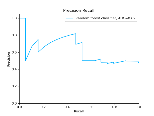
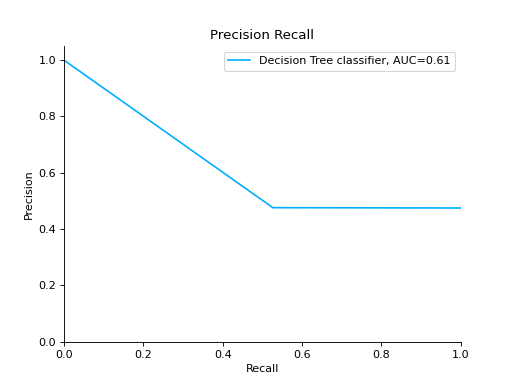
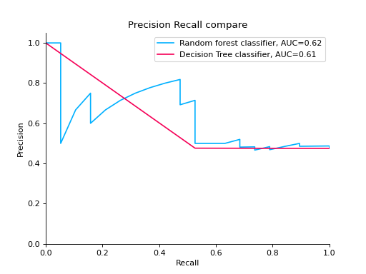
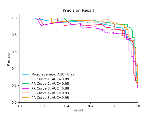
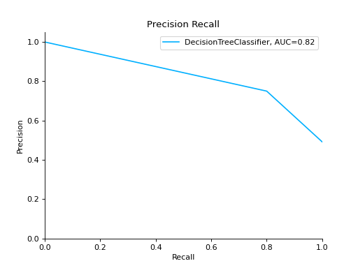
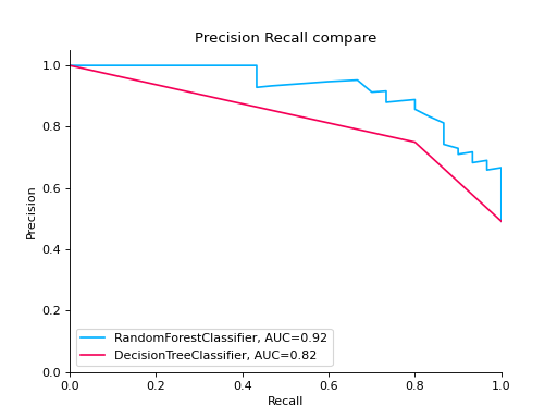
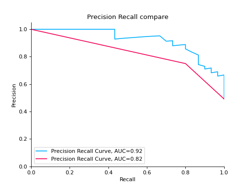
Compare Precision-Recall Curves of two classifiers:
from sklearn import datasets
from sklearn.ensemble import RandomForestClassifier
from sklearn.tree import DecisionTreeClassifier
from sklearn.model_selection import train_test_split

from sklearn_evaluation import plot

# generate data
X, y = datasets.make_classification(
    n_samples=200, n_features=10, n_informative=5, class_sep=0.65
)

# split data into train and test
X_train, X_test, y_train, y_test = train_test_split(X, y, test_size=0.2)

est = RandomForestClassifier()
est.fit(X_train, y_train)

y_pred = est.predict(X_test)
y_score = est.predict_proba(X_test)
y_true = y_test

# precision recall plot for random forest
forest_pr = plot.PrecisionRecall.from_raw_data(
    y_true, y_score, label="Random forest classifier"
)

est = DecisionTreeClassifier()
est.fit(X_train, y_train)
y_pred = est.predict(X_test)
y_score = est.predict_proba(X_test)
y_true = y_test

# precision recall plot for decision tree
tree_pr = plot.PrecisionRecall.from_raw_data(
    y_true, y_score, label="Decision Tree classifier"
)

# compare two precision recall curves
forest_pr + tree_pr
Notes
New in version 0.10.1.
- classmethod from_raw_data(y_true, y_score, *, label=None)#
Plot precision-recall curve from raw data.
- Parameters
y_true (array-like, shape = [n_samples]) – Correct target values (ground truth).
y_score (array-like, shape = [n_samples] or [n_samples, 2] for binary) – classification or [n_samples, n_classes] for multiclass Target scores (estimator predictions).
label (string or list, optional) – labels for the curves
Notes
It is assumed that the y_score parameter columns are in order. For example, if
y_true = [2, 2, 1, 0, 0, 1, 2], then the first column in y_score must contain the scores for class 0, second column for class 1 and so on.
- plot(**kwargs)#
All plotting related code must be here with one optional argument
ax=None. Must assign,self.ax_, andself.figure_attributes and returnself.
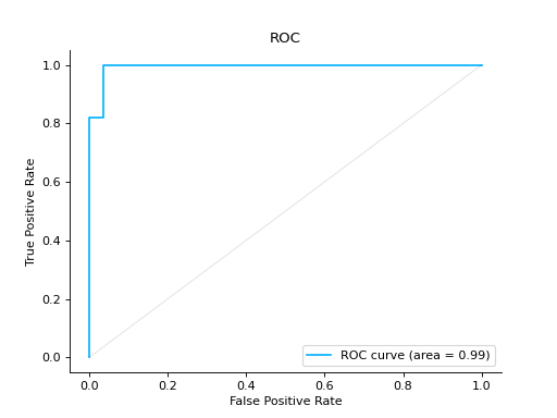
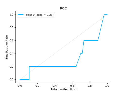
ROC#
- class sklearn_evaluation.plot.ROC(fpr, tpr, label=None)#
Plot ROC curve
- Parameters
fpr (ndarray of shape (>2,), list of lists or list of numbers) – Increasing false positive rates such that element i is the false positive rate of predictions with score >= thresholds[i].
tpr (ndarray of shape (>2,), list of lists or list of numbers) – Increasing true positive rates such that element i is the true positive rate of predictions with score >= thresholds[i].
label (list of str, default: None) – Set curve labels
ax (matplotlib Axes, default: None) – Axes object to draw the plot onto, otherwise uses current Axes
seealso: (..) –
roc():
Examples
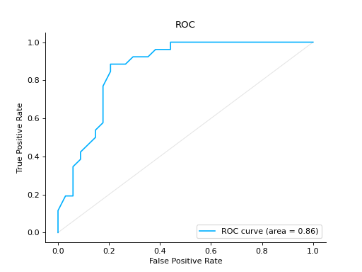
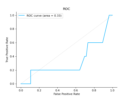
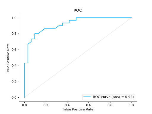
Plot a ROC Curve for binary classification:
from sklearn import datasets
from sklearn.ensemble import RandomForestClassifier
from sklearn.model_selection import train_test_split

from sklearn_evaluation import plot

# generate data
data = datasets.make_classification(200, 10, n_informative=5, class_sep=0.65)
X = data[0]
y = data[1]

# split data into train and test
X_train, X_test, y_train, y_test = train_test_split(X, y, test_size=0.3)

est = RandomForestClassifier()
est.fit(X_train, y_train)

y_score = est.predict_proba(X_test)
y_true = y_test

# plot the roc curve
roc = plot.ROC.from_raw_data(y_true, y_score)
roc
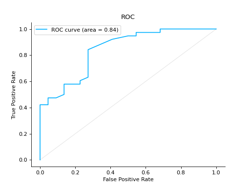
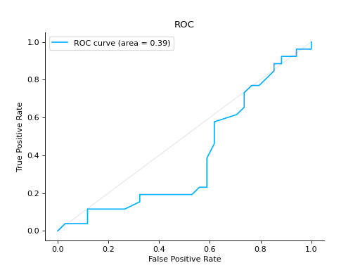
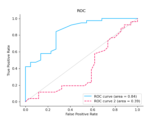
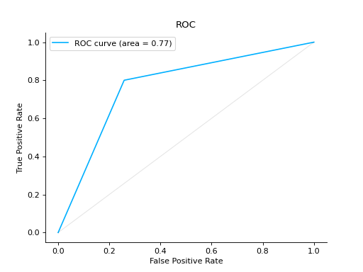
Compare ROC Curves of two binary classifiers:
from sklearn import datasets
from sklearn.ensemble import RandomForestClassifier
from sklearn.model_selection import train_test_split

from sklearn_evaluation import plot

# generate data
X, y = datasets.make_classification(200, 10, n_informative=5, class_sep=0.65)

# split data into train and test
X_train, X_test, y_train, y_test = train_test_split(X, y, test_size=0.3)

est = RandomForestClassifier()
est.fit(X_train, y_train)

y_score = est.predict_proba(X_test)
y_true = y_test

roc = plot.ROC.from_raw_data(y_true, y_score)

# create another dataset
X_, y_ = datasets.make_classification(200, 10, n_informative=5, class_sep=0.15)

# split data into train and test
X_train_, X_test_, y_train_, y_test_ = train_test_split(X_, y_, test_size=0.3)

est_ = RandomForestClassifier()
est_.fit(X_train_, y_train_)

y_score_ = est.predict_proba(X_test_)
y_true_ = y_test_

roc2 = plot.ROC.from_raw_data(y_true_, y_score_)

# Compare both classifiers
roc + roc2
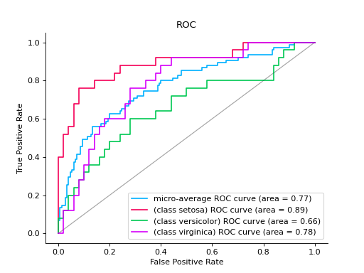
Plot a ROC Curve for multi-class classification:
import numpy as np
from sklearn.datasets import load_iris
from sklearn.linear_model import LogisticRegression
from sklearn.model_selection import train_test_split

from sklearn_evaluation import plot

# load data
iris = load_iris()
X, y = iris.data, iris.target
y = iris.target_names[y]

random_state = np.random.RandomState(0)
n_samples, n_features = X.shape

X = np.concatenate([X, random_state.randn(n_samples, 200 * n_features)], axis=1)
(
    X_train,
    X_test,
    y_train,
    y_test,
) = train_test_split(X, y, test_size=0.5, stratify=y, random_state=0)

classifier = LogisticRegression()
y_score = classifier.fit(X_train, y_train).predict_proba(X_test)

# plot roc curve
plot.ROC.from_raw_data(y_test, y_score)
Notes
New in version 0.8.4.
- classmethod from_dump(path)#
Instantiates a plot object from a path to a JSON file. A default implementation is provided, but you might override it.
- classmethod from_raw_data(y_true, y_score, ax=None)#
Takes raw unaggregated (for an example of aggregated vs unaggregated data see the constructor docstring) data, compute statistics and initializes the object. This is the method that users typically use. (e.g., they pass
y_true, andy_predhere, we aggregate and call the constructor).Apart from input data, this method must have the same argument as the constructor.
All arguments beyond the input data must be keyword-only (add a * argument between the input and the rest of the arguments).
- plot(**kwargs)#
All plotting related code must be here with one optional argument
ax=None. Must assign,self.ax_, andself.figure_attributes and returnself.
ClassificationReport#
- class sklearn_evaluation.plot.ClassificationReport(matrix, keys, *, target_names=None)#
See also
Examples
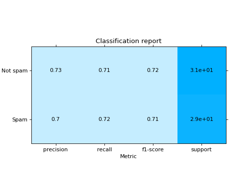
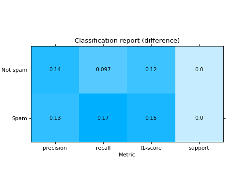
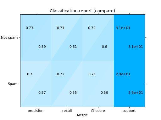
Plot a Classification Report:
from sklearn import datasets
from sklearn.ensemble import RandomForestClassifier
from sklearn.linear_model import LogisticRegression
from sklearn.model_selection import train_test_split

from sklearn_evaluation import plot

# generate data
X, y = datasets.make_classification(200, 10, n_informative=5, class_sep=0.65)

# split data into train and test
X_train, X_test, y_train, y_test = train_test_split(X, y, test_size=0.3)

y_pred_rf = RandomForestClassifier().fit(X_train, y_train).predict(X_test)
y_pred_lr = LogisticRegression().fit(X_train, y_train).predict(X_test)

target_names = ["Not spam", "Spam"]

# report for random forest
cr_rf = plot.ClassificationReport.from_raw_data(
    y_test, y_pred_rf, target_names=target_names
)

# report for logistic regression
cr_lr = plot.ClassificationReport.from_raw_data(
    y_test, y_pred_lr, target_names=target_names
)

# how better it is the random forest?
cr_rf - cr_lr

# compare both reports
cr_rf + cr_lr

- classmethod from_dump(path)#
Instantiates a plot object from a path to a JSON file. A default implementation is provided, but you might override it.
- classmethod from_raw_data(y_true, y_pred, *, target_names=None, sample_weight=None, zero_division=0)#
Takes raw unaggregated (for an example of aggregated vs unaggregated data see the constructor docstring) data, compute statistics and initializes the object. This is the method that users typically use. (e.g., they pass
y_true, andy_predhere, we aggregate and call the constructor).Apart from input data, this method must have the same argument as the constructor.
All arguments beyond the input data must be keyword-only (add a * argument between the input and the rest of the arguments).
- plot(**kwargs)#
All plotting related code must be here with one optional argument
ax=None. Must assign,self.ax_, andself.figure_attributes and returnself.
CalibrationCurve#
- class sklearn_evaluation.plot.CalibrationCurve(mean_predicted_value, fraction_of_positives, label=None, cmap=None)#
- Parameters
mean_predicted_value (ndarray of shape (n_bins,) or smaller) – The mean predicted probability in each bin.
fraction_of_positives (ndarray of shape (n_bins,) or smaller) – The proportion of samples whose class is the positive class, in each bin.
label (list of str, optional) – A list of strings, where each string refers to the name of the classifier that produced the corresponding probability estimates in probabilities. If
None, the names “Classifier 1”, “Classifier 2”, etc. will be used.cmap (string or
matplotlib.colors.Colormapinstance, optional) – Colormap used for plotting the projection. View Matplotlib Colormap documentation for available options. https://matplotlib.org/users/colormaps.html
Examples
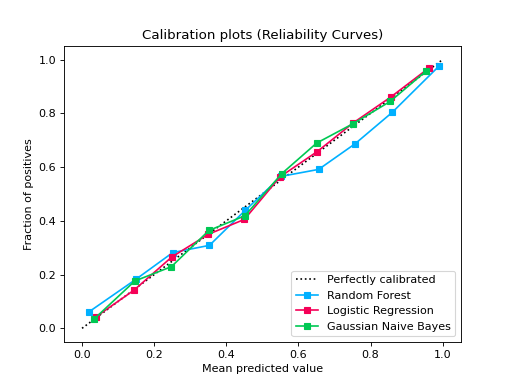
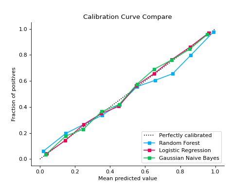
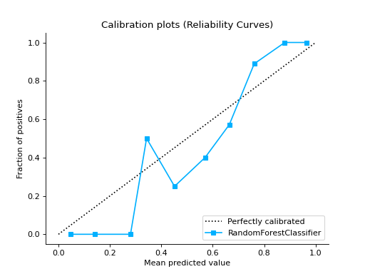
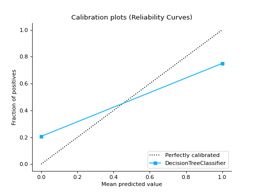
from sklearn.datasets import make_classification
from sklearn.model_selection import train_test_split
from sklearn.ensemble import RandomForestClassifier
from sklearn.linear_model import LogisticRegression
from sklearn.naive_bayes import GaussianNB

from sklearn_evaluation import plot

X, y = make_classification(
    n_samples=20000, n_features=2, n_informative=2, n_redundant=0, random_state=0
)
X_train, X_test, y_train, y_test = train_test_split(
    X, y, test_size=0.33, random_state=0
)

rf = RandomForestClassifier()
lr = LogisticRegression()
nb = GaussianNB()

rf_probas = rf.fit(X_train, y_train).predict_proba(X_test)
lr_probas = lr.fit(X_train, y_train).predict_proba(X_test)
nb_probas = nb.fit(X_train, y_train).predict_proba(X_test)

probabilities = [rf_probas, lr_probas, nb_probas]

clf_names = [
    "Random Forest",
    "Logistic Regression",
    "Gaussian Naive Bayes",
]

plot.CalibrationCurve.from_raw_data(y_test, probabilities, label=clf_names)
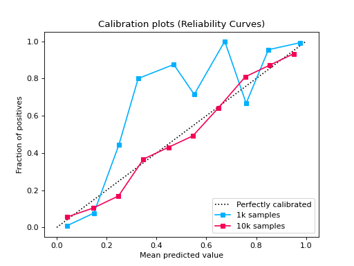
from sklearn.datasets import make_classification
from sklearn.model_selection import train_test_split
from sklearn.linear_model import LogisticRegression

from sklearn_evaluation import plot


def make_dataset(n_samples):
    X, y = make_classification(
        n_samples=n_samples,
        n_features=2,
        n_informative=2,
        n_redundant=0,
        random_state=0,
    )
    return train_test_split(X, y, test_size=0.33, random_state=0)


# sample size 1k
X_train, X_test, y_train, y_test1 = make_dataset(n_samples=1000)
probs1 = LogisticRegression().fit(X_train, y_train).predict_proba(X_test)

# sample size 10k
X_train, X_test, y_train, y_test2 = make_dataset(n_samples=10000)
probs2 = LogisticRegression().fit(X_train, y_train).predict_proba(X_test)

# if you want plot probability curves for different sample sizes, pass
# a list with the true labels per each element in the probabilities
# argument
plot.CalibrationCurve.from_raw_data(
    [y_test1, y_test2], [probs1, probs2], label=["1k samples", "10k samples"]
)
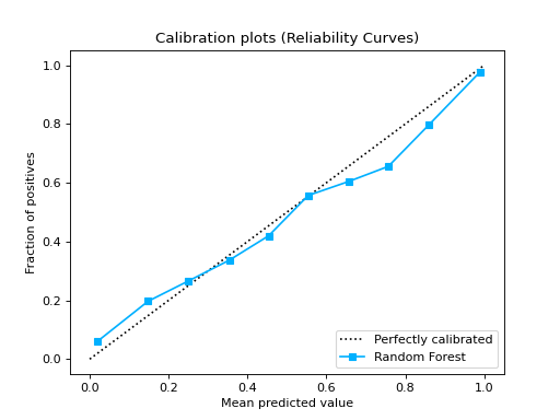
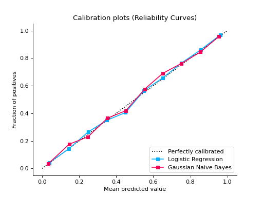
from sklearn.datasets import make_classification
from sklearn.model_selection import train_test_split
from sklearn.ensemble import RandomForestClassifier
from sklearn.linear_model import LogisticRegression
from sklearn.naive_bayes import GaussianNB

from sklearn_evaluation import plot


X, y = make_classification(
    n_samples=20000, n_features=2, n_informative=2, n_redundant=0, random_state=0
)
X_train, X_test, y_train, y_test = train_test_split(
    X, y, test_size=0.33, random_state=0
)

rf = RandomForestClassifier()
lr = LogisticRegression()
nb = GaussianNB()

rf_probas = rf.fit(X_train, y_train).predict_proba(X_test)
lr_probas = lr.fit(X_train, y_train).predict_proba(X_test)
nb_probas = nb.fit(X_train, y_train).predict_proba(X_test)

probabilities = [rf_probas, lr_probas, nb_probas]

clf_names = [
    "Random Forest",
    "Logistic Regression",
    "Gaussian Naive Bayes",
]

cc1 = plot.CalibrationCurve.from_raw_data(y_test, [rf_probas], label=["Random Forest"])
cc2 = plot.CalibrationCurve.from_raw_data(
    y_test,
    [lr_probas, nb_probas],
    label=["Logistic Regression", "Gaussian Naive Bayes"],
)
cc1 + cc2
Notes
New in version 0.11.1.
- classmethod from_raw_data(y_true, probabilities, *, label=None, n_bins=10, cmap=None)#
Plots calibration curves for a set of classifier probability estimates. Calibration curves help determining whether you can interpret predicted probabilities as confidence level. For example, if we take a well-calibrated and take the instances where the score is 0.8, 80% of those instanes should be from the positive class. This function only works for binary classifiers.
- Parameters
y_true (array-like, shape = [n_samples] or list with array-like:) – Ground truth (correct) target values. If passed a single array- object, it assumes all the probabilities have the same shape as y_true. If passed a list, it expects y_true[i] to have the same size as probabilities[i]
probabilities (list of array-like, shape (n_samples, 2) or (n_samples,)) – A list containing the outputs of binary classifiers’
predict_proba()method ordecision_function()method.label (list of str, optional)) – A list of strings, where each string refers to the name of the classifier that produced the corresponding probability estimates in probabilities. If
None, the names “Classifier 1”, “Classifier 2”, etc. will be used.n_bins (int, optional, default=10) – Number of bins. A bigger number requires more data.
cmap (string or
matplotlib.colors.Colormapinstance, optional) – Colormap used for plotting the projection. View Matplotlib Colormap documentation for available options. https://matplotlib.org/users/colormaps.html
- plot(ax=None)#
Create the plot :param ax: An Axes object to add the plot to :type ax: matplotlib.Axes
Rank1D#
- class sklearn_evaluation.plot.Rank1D(algorithm='shapiro', features=None, figsize=(7, 7), orient='h', color=None, ax=None)#
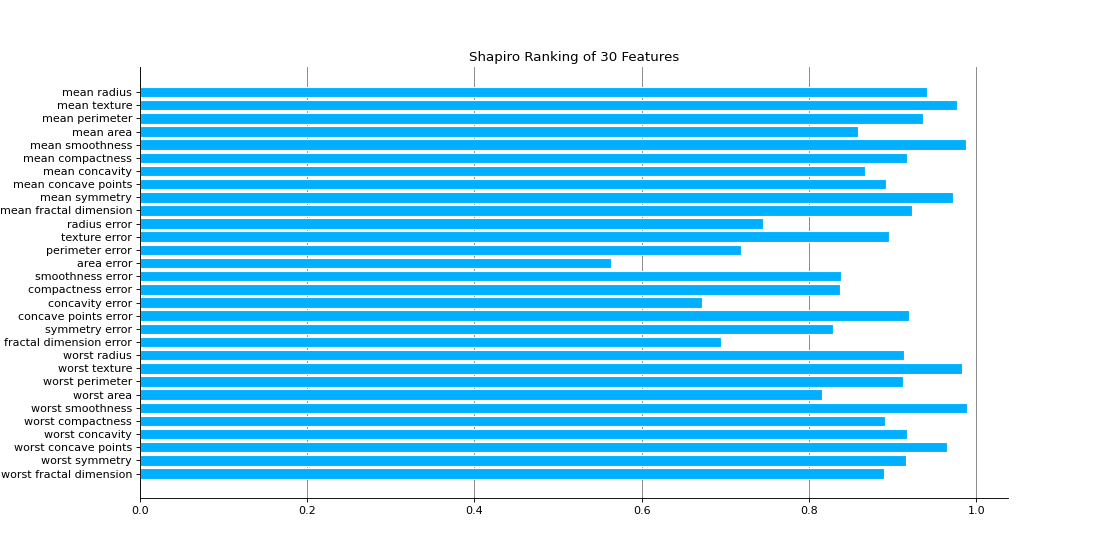
Rank1D computes a score for each feature in the data set with a specific metric or algorithm (e.g. Shapiro-Wilk) then returns the features ranked as a bar plot.
- Parameters
algorithm (one of {'shapiro', }, default: 'shapiro') – The ranking algorithm to use, default is ‘Shapiro-Wilk.
features (list) – A list of feature names to use. If a DataFrame is passed features is None, feature names are selected as the columns of the DataFrame.
figsize (tuple, optional) – (width, height) for specifying the size of the plot.
orient ('h' or 'v', default='h') – Specifies a horizontal or vertical bar chart.
color (string) – Specify color for barchart
ax (matplotlib Axes, default: None) – The axis to plot the figure on. If None is passed in the current axes will be used (or generated if required).
- ranks_#
An array of rank scores with shape (n,), where n is the number of features.
- Type
ndarray
Examples
Visualize the Feature Rankings:
import matplotlib.pyplot as plt
from sklearn_evaluation.plot import Rank1D

from sklearn.datasets import load_breast_cancer as load_data

# load some data
X, y = load_data(return_X_y=True)

features = [
    "mean radius",
    "mean texture",
    "mean perimeter",
    "mean area",
    "mean smoothness",
    "mean compactness",
    "mean concavity",
    "mean concave points",
    "mean symmetry",
    "mean fractal dimension",
    "radius error",
    "texture error",
    "perimeter error",
    "area error",
    "smoothness error",
    "compactness error",
    "concavity error",
    "concave points error",
    "symmetry error",
    "fractal dimension error",
    "worst radius",
    "worst texture",
    "worst perimeter",
    "worst area",
    "worst smoothness",
    "worst compactness",
    "worst concavity",
    "worst concave points",
    "worst symmetry",
    "worst fractal dimension",
]

# plot feature rankings
rank1d = Rank1D(features=features, figsize=(14, 7))
rank1d.feature_ranks(X)
plt.show()
Notes
New in version 0.8.4.
- feature_ranks(X)#
- Parameters
X (array-like, shape (n_samples, n_features)) – Feature dataset to be ranked. Refer https://numpy.org/doc/stable/glossary.html#term-array-like
- Returns
ax – Axes containing the plot
- Return type
matplotlib Axes
- feature_ranks_custom_algorithm(ranks)#
This method is useful if user wants to use custom algorithm for feature ranking.
- Parameters
ranks (ndarray) – An n-dimensional, symmetric array of rank scores, where n is the number of features. E.g. for 1D ranking, it is (n,), for a 2D ranking it is (n,n).
- Returns
ax – Axes containing the plot
- Return type
matplotlib Axes
Rank2D#
- class sklearn_evaluation.plot.Rank2D(algorithm='pearson', features=None, colormap='RdBu_r', figsize=(7, 7), ax=None)#
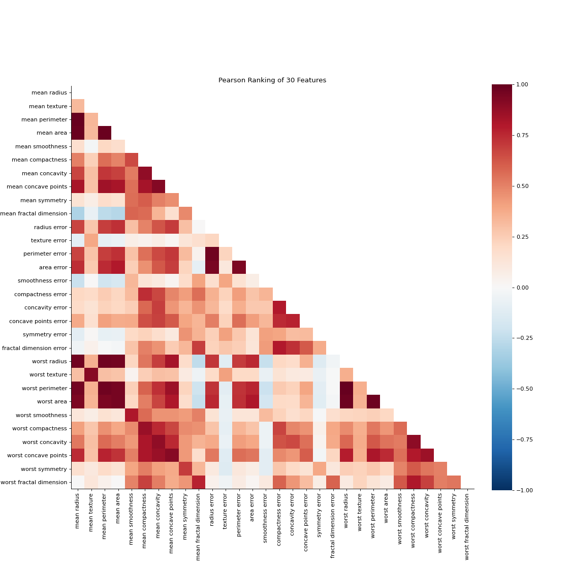
Rank2D performs pairwise comparisons of each feature in the data set with a specific metric or algorithm (e.g. Pearson correlation) then returns them ranked as a lower left triangle diagram.
- Parameters
algorithm (str, default: 'pearson') – The ranking algorithm to use, one of: ‘pearson’, ‘covariance’, ‘spearman’, or ‘kendalltau’.
features (list) – A list of feature names to use. If a DataFrame is passed features is None, feature names are selected as the columns of the DataFrame.
colormap (string or cmap, default: 'RdBu_r') – optional string or matplotlib cmap to colorize lines Use either color to colorize the lines on a per class basis or colormap to color them on a continuous scale.
figsize (tuple, optional) – (width, height) for specifying the size of the plot
ax (matplotlib Axes, default: None) – The axis to plot the figure on. If None is passed in the current axes will be used (or generated if required).
- ranks_#
An array of rank scores with shape (n,n), where n is the number of features.
- Type
ndarray
Examples
Visualize the Feature Rankings by Pairwise Comparison:
import matplotlib.pyplot as plt
from sklearn_evaluation.plot import Rank2D

from sklearn.datasets import load_breast_cancer as load_data

# load some data
X, y = load_data(return_X_y=True)

features = [
    "mean radius",
    "mean texture",
    "mean perimeter",
    "mean area",
    "mean smoothness",
    "mean compactness",
    "mean concavity",
    "mean concave points",
    "mean symmetry",
    "mean fractal dimension",
    "radius error",
    "texture error",
    "perimeter error",
    "area error",
    "smoothness error",
    "compactness error",
    "concavity error",
    "concave points error",
    "symmetry error",
    "fractal dimension error",
    "worst radius",
    "worst texture",
    "worst perimeter",
    "worst area",
    "worst smoothness",
    "worst compactness",
    "worst concavity",
    "worst concave points",
    "worst symmetry",
    "worst fractal dimension",
]

# plot feature rankings
rank2d = Rank2D(features=features, figsize=(14, 14))
rank2d.feature_ranks(X)
plt.show()
Notes
New in version 0.8.4.
- feature_ranks(X)#
- Parameters
X (array-like, shape (n_samples, n_features)) – Feature dataset to be ranked. Refer https://numpy.org/doc/stable/glossary.html#term-array-like
- Returns
ax – Axes containing the plot
- Return type
matplotlib Axes
- feature_ranks_custom_algorithm(ranks)#
This method is useful if user wants to use custom algorithm for feature ranking.
- Parameters
ranks (ndarray) – An n-dimensional, symmetric array of rank scores, where n is the number of features. E.g. for 1D ranking, it is (n,), for a 2D ranking it is (n,n).
- Returns
ax – Axes containing the plot
- Return type
matplotlib Axes
Functional API#
calibration_curve#
- sklearn_evaluation.plot.calibration_curve(y_true, probabilities, clf_names=None, n_bins=10, cmap='nipy_spectral', ax=None)#
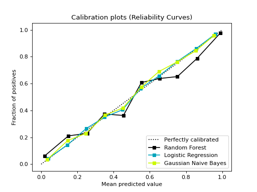
Plots calibration curves for a set of classifier probability estimates. Calibration curves help determining whether you can interpret predicted probabilities as confidence level. For example, if we take a well-calibrated and take the instances where the score is 0.8, 80% of those instanes should be from the positive class. This function only works for binary classifiers.
- Parameters
y_true (array-like, shape = [n_samples] or list with array-like:) – Ground truth (correct) target values. If passed a single array- object, it assumes all the probabilities have the same shape as y_true. If passed a list, it expects y_true[i] to have the same size as probabilities[i]
probabilities (list of array-like, shape (n_samples, 2) or (n_samples,)) – A list containing the outputs of binary classifiers’
predict_proba()method ordecision_function()method.clf_names (list of str, optional)) – A list of strings, where each string refers to the name of the classifier that produced the corresponding probability estimates in probabilities. If
None, the names “Classifier 1”, “Classifier 2”, etc. will be used.n_bins (int, optional, default=10) – Number of bins. A bigger number requires more data.
cmap (string or
matplotlib.colors.Colormapinstance, optional) – Colormap used for plotting the projection. View Matplotlib Colormap documentation for available options. https://matplotlib.org/users/colormaps.htmlax (matplotlib Axes) – Axes object to draw the plot onto, otherwise uses current Axes
- Returns
ax – Axes containing the plot
- Return type
matplotlib Axes
Examples
from sklearn.datasets import make_classification
from sklearn.model_selection import train_test_split
from sklearn.ensemble import RandomForestClassifier
from sklearn.linear_model import LogisticRegression
from sklearn.naive_bayes import GaussianNB

from sklearn_evaluation import plot

# generate data
X, y = make_classification(
    n_samples=20000, n_features=2, n_informative=2, n_redundant=0, random_state=0
)

# split data into train and test
X_train, X_test, y_train, y_test = train_test_split(
    X, y, test_size=0.33, random_state=0
)

rf = RandomForestClassifier()
lr = LogisticRegression()
nb = GaussianNB()

rf_probas = rf.fit(X_train, y_train).predict_proba(X_test)
lr_probas = lr.fit(X_train, y_train).predict_proba(X_test)
nb_probas = nb.fit(X_train, y_train).predict_proba(X_test)

# list of probabilities for different classifier
probabilities = [rf_probas, lr_probas, nb_probas]

clf_names = [
    "Random Forest",
    "Logistic Regression",
    "Gaussian Naive Bayes",
]

# plot calibration curve
plot.calibration_curve(y_test, probabilities, clf_names=clf_names)
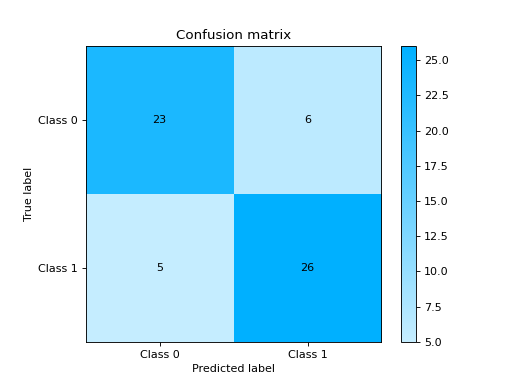
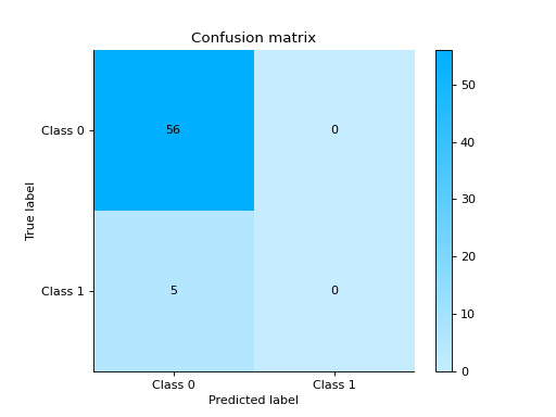
confusion_matrix#
- sklearn_evaluation.plot.confusion_matrix(y_true, y_pred, target_names=None, normalize=False, cmap=None, ax=None)#
Plot confusion matrix.
See also
- Parameters
y_true (array-like, shape = [n_samples]) – Correct target values (ground truth).
y_pred (array-like, shape = [n_samples]) – Target predicted classes (estimator predictions).
target_names (list) – List containing the names of the target classes. List must be in order e.g.
['Label for class 0', 'Label for class 1']. IfNone, generic labels will be generated e.g.['Class 0', 'Class 1']ax (matplotlib Axes) – Axes object to draw the plot onto, otherwise uses current Axes
normalize (bool) – Normalize the confusion matrix
cmap (matplotlib Colormap) – If
Noneuses a modified version of matplotlib’s OrRd colormap.
- Returns
ax – Axes containing the plot
- Return type
matplotlib Axes
Examples
Plot a Confusion Matrix for binary classifier:
from sklearn import datasets
from sklearn.ensemble import RandomForestClassifier
from sklearn.model_selection import train_test_split

from sklearn_evaluation import plot

# generate data
X, y = datasets.make_classification(200, 10, n_informative=5, class_sep=0.65)

# split data into train and test
X_train, X_test, y_train, y_test = train_test_split(X, y, test_size=0.3)

est = RandomForestClassifier()
est.fit(X_train, y_train)

y_pred = est.predict(X_test)
y_true = y_test

# plot confusion matrix
plot.confusion_matrix(y_true, y_pred)
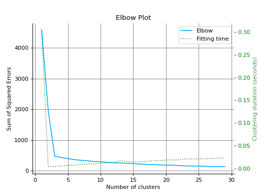
elbow_curve#
- sklearn_evaluation.plot.elbow_curve(X, clf, range_n_clusters=None, n_jobs=1, show_cluster_time=True, ax=None)#
Plots elbow curve of different values of K of a clustering algorithm.
- Parameters
X (array-like, shape = [n_samples, n_features]:) – Data to cluster, where n_samples is the number of samples and n_features is the number of features. Refer https://numpy.org/doc/stable/glossary.html#term-array-like
clf – Clusterer instance that implements
fit,``fit_predict``, andscoremethods, and anrange_n_clustershyperparameter. e.g.sklearn.cluster.KMeansinstancerange_n_clusters (None or
listof int, optional) – List of n_clusters for which to plot the explained variances. Defaults to[1, 3, 5, 7, 9, 11].n_jobs (int, optional) – Number of jobs to run in parallel. Defaults to 1.
show_cluster_time (bool, optional) – Include plot of time it took to cluster for a particular K.
ax (
matplotlib.axes.Axes, optional) – The axes upon which to plot the curve. If None, the plot is drawn on the current Axes
- Returns
ax – Axes containing the plot
- Return type
matplotlib Axes
Examples
Plot the Elbow Curve:
from sklearn.cluster import KMeans
from sklearn.datasets import make_blobs

from sklearn_evaluation import plot

# generate data
X, _ = make_blobs(n_samples=100, centers=3, n_features=5, random_state=0)
kmeans = KMeans(random_state=1, n_init=5)

# plot elbow curve
plot.elbow_curve(X, kmeans, range_n_clusters=range(1, 30))
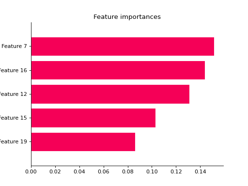
feature_importances#
- sklearn_evaluation.plot.feature_importances(data, top_n=None, feature_names=None, orientation='horizontal', ax=None)#
Get and order feature importances from a scikit-learn model or from an array-like structure. If data is a scikit-learn model with sub-estimators (e.g. RandomForest, AdaBoost) the function will compute the standard deviation of each feature.
- Parameters
data (sklearn model or array-like structure) – Object to get the data from.
top_n (int) – Only get results for the top_n features.
feature_names (array-like) – Feature names
orientation (('horizontal', 'vertical')) – Bar plot orientation
ax (matplotlib Axes) – Axes object to draw the plot onto, otherwise uses current Axes
- Returns
ax – Axes containing the plot
- Return type
matplotlib Axes
Examples
Plot Feature Importances:
from sklearn import datasets
from sklearn.ensemble import RandomForestClassifier
from sklearn.model_selection import train_test_split

from sklearn_evaluation import plot

# generate data
X, y = datasets.make_classification(200, 20, n_informative=5, class_sep=0.65)

# split data into train and test
X_train, X_test, y_train, y_test = train_test_split(X, y, test_size=0.3)

model = RandomForestClassifier(n_estimators=1)
model.fit(X_train, y_train)

# plot all features
ax = plot.feature_importances(model)

# only top 5
plot.feature_importances(model, top_n=5)
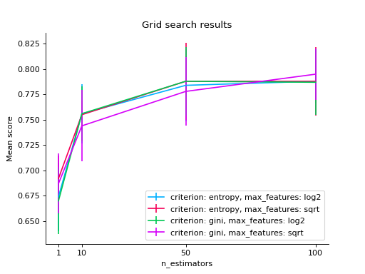
grid_search#
- sklearn_evaluation.plot.grid_search(cv_results_, change, subset=None, kind='line', cmap=None, ax=None, sort=True)#
Plot results from a sklearn grid search by changing two parameters at most.
- Parameters
cv_results (list of named tuples) – Results from a sklearn grid search (get them using the cv_results_ parameter)
change (str or iterable with len<=2) – Parameter to change
subset (dictionary-like) – parameter-value(s) pairs to subset from grid_scores. (e.g.
{'n_estimators': [1, 10]}), if None all combinations will be used.kind (['line', 'bar']) – This only applies whe change is a single parameter. Changes the type of plot
cmap (matplotlib Colormap) – This only applies when change are two parameters. Colormap used for the matrix. If None uses a modified version of matplotlib’s OrRd colormap.
ax (matplotlib Axes) – Axes object to draw the plot onto, otherwise uses current Axes
sort (bool) – If True sorts the results in alphabetical order.
- Returns
ax – Axes containing the plot
- Return type
matplotlib Axes
Examples
Plot the results of grid search:
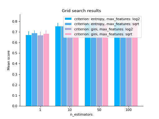
import matplotlib.pyplot as plt
from sklearn.ensemble import RandomForestClassifier
from sklearn.model_selection import GridSearchCV
from sklearn import datasets

from sklearn_evaluation.plot import grid_search

# load data
iris = datasets.load_iris()


parameters = {
    "n_estimators": [1, 10, 50, 100],
    "criterion": ["gini", "entropy"],
    "max_features": ["sqrt", "log2"],
}

est = RandomForestClassifier()
clf = GridSearchCV(est, parameters, cv=5)

# generate some data
X, y = datasets.make_classification(1000, 10, n_informative=5, class_sep=0.7)
clf.fit(X, y)

# changing numeric parameter without any restrictions
# in the rest of the parameter set
grid_search(clf.cv_results_, change="n_estimators")
plt.show()
# you can also use bars
grid_search(clf.cv_results_, change="n_estimators", kind="bar")
plt.show()
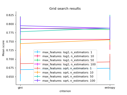
# changing a categorical variable without any constraints
grid_search(clf.cv_results_, change="criterion")
plt.show()
# bar
grid_search(clf.cv_results_, change="criterion", kind="bar")
plt.show()
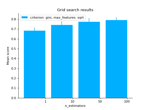
# varying a numerical parameter but constraining
# the rest of the parameter set
grid_search(
    clf.cv_results_,
    change="n_estimators",
    subset={"max_features": "sqrt", "criterion": "gini"},
    kind="bar",
)
plt.show()
# same as above but letting max_features to have two values
grid_search(
    clf.cv_results_,
    change="n_estimators",
    subset={"max_features": ["sqrt", "log2"], "criterion": "gini"},
    kind="bar",
)
plt.show()
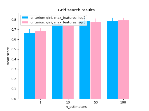
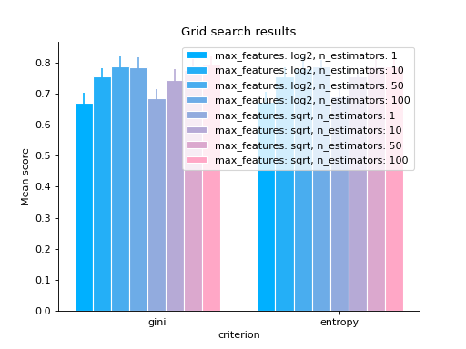
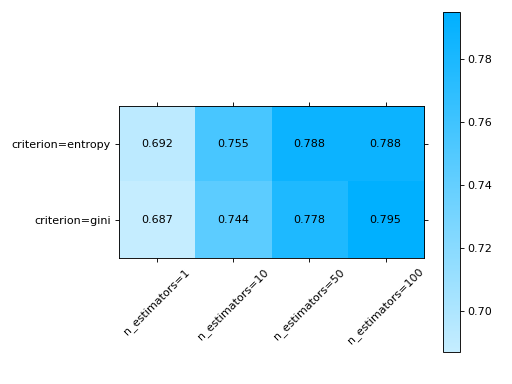
# varying two parameters - you can only show this as a
# matrix so the kind parameter will be ignored
grid_search(
    clf.cv_results_,
    change=("n_estimators", "criterion"),
    subset={"max_features": "sqrt"},
)
plt.show()
metrics_at_thresholds#
- sklearn_evaluation.plot.metrics_at_thresholds(fn, y_true, y_score, n_thresholds=10, start=0.0, ax=None)#
Plot metrics at increasing thresholds
precision_at_proportions#
- sklearn_evaluation.plot.precision_at_proportions(y_true, y_score, ax=None)#
Plot precision values at different proportions.
- Parameters
y_true (array-like) – Correct target values (ground truth).
y_score (array-like) – Target scores (estimator predictions).
ax (matplotlib Axes) – Axes object to draw the plot onto, otherwise uses current Axes
- Returns
ax – Axes containing the plot
- Return type
matplotlib Axes
precision_recall#
- sklearn_evaluation.plot.precision_recall(y_true, y_score, ax=None)#
Plot precision-recall curve.
- Parameters
y_true (array-like, shape = [n_samples]) – Correct target values (ground truth).
y_score (array-like, shape = [n_samples] or [n_samples, 2] for binary) – classification or [n_samples, n_classes] for multiclass Target scores (estimator predictions).
ax (matplotlib Axes) – Axes object to draw the plot onto, otherwise uses current Axes
Notes
It is assumed that the y_score parameter columns are in order. For example, if
y_true = [2, 2, 1, 0, 0, 1, 2], then the first column in y_score must contain the scores for class 0, second column for class 1 and so on.- Returns
ax – Axes containing the plot
- Return type
matplotlib Axes
Examples
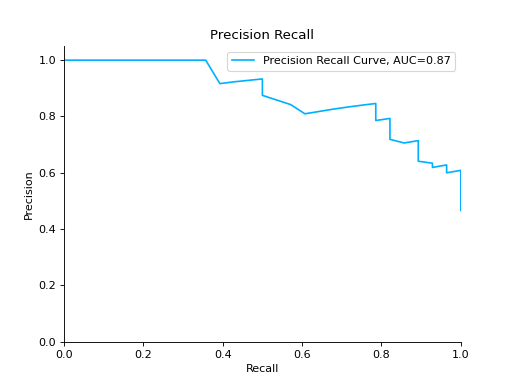
Plot a Precision-Recall Curve for binary classification:
import matplotlib.pyplot as plt
from sklearn import datasets
from sklearn.ensemble import RandomForestClassifier
from sklearn.model_selection import train_test_split

from sklearn_evaluation import plot

# generate data
data = datasets.make_classification(200, 10, n_informative=5, class_sep=0.65)
X = data[0]
y = data[1]

# split data into train and test
X_train, X_test, y_train, y_test = train_test_split(X, y, test_size=0.3)

est = RandomForestClassifier()
est.fit(X_train, y_train)

y_score = est.predict_proba(X_test)
y_true = y_test

# plot precision recall curve
plot.precision_recall(y_true, y_score)
plt.show()
Plot a Precision-Recall Curve for multi-class classification:
import matplotlib.pyplot as plt
from sklearn import datasets
from sklearn.ensemble import RandomForestClassifier
from sklearn.model_selection import train_test_split

from sklearn_evaluation import plot

# generate data for multiclass classification
data = datasets.make_classification(
    n_samples=1000,
    n_features=10,
    n_informative=5,
    n_classes=5,
    n_redundant=0,
    n_clusters_per_class=1,
    random_state=0,
)
X = data[0]
y = data[1]

# split data into train and test
X_train, X_test, y_train, y_test = train_test_split(X, y, test_size=0.3)

est = RandomForestClassifier()
est.fit(X_train, y_train)

y_score = est.predict_proba(X_test)
y_true = y_test

# plot precision recall curve
plot.precision_recall(y_true, y_score)
plt.show()
roc#
- sklearn_evaluation.plot.roc(y_true, y_score, ax=None)#
Plot ROC curve
- Parameters
y_true (array-like, shape = [n_samples]) –
Correct target values (ground truth).
e.g
”classes” format : [0, 1, 2, 0, 1, …] or [‘virginica’, ‘versicolor’, ‘virginica’, ‘setosa’, …]
- one-hot encoded classes[[0, 0, 1],
[1, 0, 0]]
y_score (array-like, shape = [n_samples] or [n_samples, 2] for binary) –
classification or [n_samples, n_classes] for multiclass Target scores (estimator predictions).
e.g
- ”scores” format[[0.1, 0.1, 0.8],
[0.7, 0.15, 0.15]]
ax (matplotlib Axes, default: None) – Axes object to draw the plot onto, otherwise uses current Axes
Notes
It is assumed that the y_score parameter columns are in order. For example, if
y_true = [2, 2, 1, 0, 0, 1, 2], then the first column in y_score must contain the scores for class 0, second column for class 1 and so on.See also
Examples
Plot a ROC Curve for binary classification:
from sklearn import datasets
from sklearn.ensemble import RandomForestClassifier
from sklearn.model_selection import train_test_split

from sklearn_evaluation import plot

# generate data
X, y = datasets.make_classification(200, 10, n_informative=5, class_sep=0.65)

# split data into train and test
X_train, X_test, y_train, y_test = train_test_split(X, y, test_size=0.3)

est = RandomForestClassifier()
est.fit(X_train, y_train)

# y_pred = est.predict(X_test)
y_score = est.predict_proba(X_test)

# plot roc curve
plot.roc(y_test, y_score)
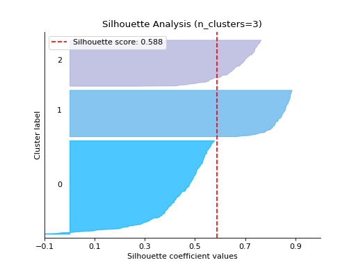
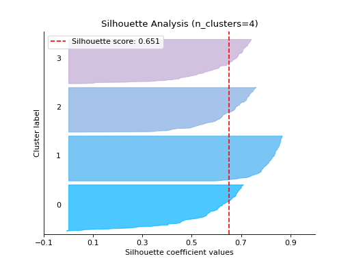
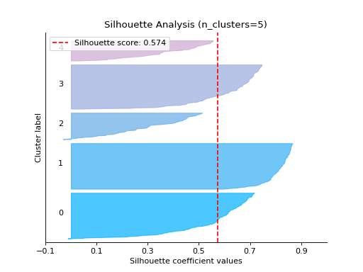
silhouette_analysis#
- sklearn_evaluation.plot.silhouette_analysis(X, clf, range_n_clusters=None, metric='euclidean', figsize=None, cmap=None, text_fontsize='medium', ax=None)#
Plots silhouette analysis of clusters provided.
- Parameters
X (array-like, shape = [n_samples, n_features]:) – Cluster data, where n_samples is the number of samples and n_features is the number of features. Refer https://numpy.org/doc/stable/glossary.html#term-array-like
clf – Clusterer instance that implements
fit,``fit_predict``, andscoremethods, and ann_clustershyperparameter. e.g.sklearn.cluster.KMeansinstancerange_n_clusters (None or
listof int, optional) – List of n_clusters for which to plot the silhouette scores. Defaults to[2, 3, 4, 5, 6].metric (string or callable, optional:) – The metric to use when calculating distance between instances in a feature array. If metric is a string, it must be one of the options allowed by sklearn.metrics.pairwise.pairwise_distances. If X is the distance array itself, use “precomputed” as the metric.
figsize (2-tuple, optional:) – Tuple denoting figure size of the plot e.g. (6, 6). Defaults to
None.cmap (string or
matplotlib.colors.Colormapinstance, optional:) – Colormap used for plotting the projection. View Matplotlib Colormap documentation for available options. https://matplotlib.org/users/colormaps.htmltext_fontsize (string or int, optional:) – Matplotlib-style fontsizes. Use e.g. “small”, “medium”, “large” or integer-values. Defaults to “medium”.
ax (
matplotlib.axes.Axes, optional:) – The axes upon which to plot the curve. If None, the plot is drawn on a new set of axes.
- Returns
ax – Axes containing the plot
- Return type
matplotlib Axes
Examples
Plot the Silhouette Analysis:
from sklearn.cluster import KMeans
from sklearn.datasets import make_blobs

from sklearn_evaluation import plot

# generate data
X, y = make_blobs(
    n_samples=500,
    n_features=2,
    centers=4,
    cluster_std=1,
    center_box=(-10.0, 10.0),
    shuffle=True,
    random_state=1,
)

kmeans = KMeans(random_state=1, n_init=5)

# plot silhouette analysis of provided clusters
plot.silhouette_analysis(X, kmeans, range_n_clusters=[3])
Notes
New in version 0.8.3.
silhouette_analysis_from_results#
- sklearn_evaluation.plot.silhouette_analysis_from_results(X, cluster_labels, metric='euclidean', figsize=None, cmap=None, text_fontsize='medium', ax=None)#
Same as silhouette_plot but takes list of cluster_labels as input. Useful if you want to train the model yourself
Examples
Plot the Silhouette Analysis from the results:
from sklearn.cluster import KMeans
from sklearn.datasets import make_blobs

from sklearn_evaluation import plot

# generate data
X, y = make_blobs(
    n_samples=500,
    n_features=2,
    centers=4,
    cluster_std=1,
    center_box=(-10.0, 10.0),
    shuffle=True,
    random_state=1,
)

cluster_labels = []

# Cluster labels for four clusters
kmeans = KMeans(n_clusters=4, n_init=5)
cluster_labels.append(kmeans.fit_predict(X))

# Cluster labels for five clusters
kmeans = KMeans(n_clusters=5, n_init=5)
cluster_labels.append(kmeans.fit_predict(X))

# plot silhouette analysis from provided list of cluster labels
plot.silhouette_analysis_from_results(X, cluster_labels)
report_evaluation#
- sklearn_evaluation.report.evaluate_model(model, y_true, y_pred, X_test=None, y_score=None, report_title=None)#
Evaluates a given model and generates an HTML report
- Parameters
model (estimator) – An estimator to evaluate.
y_true (array-like) – Correct target values (ground truth).
y_pred (array-like) – Target predicted classes (estimator predictions).
y_score (array-like, default None) – Target scores (estimator predictions).
report_title (str, default "Model evaluation - {model_name}") –
Examples
See also
Generate evaluation report for RandomForestClassifier
import urllib.request

from sklearn.ensemble import RandomForestClassifier
import pandas as pd
from sklearn.model_selection import train_test_split
from sklearn_evaluation.report import evaluate_model

url = (
    "https://raw.githubusercontent.com/sharmaroshan/Heart-UCI-Dataset/master/heart.csv"
)

urllib.request.urlretrieve(
    url,
    filename="heart.csv",
)

column = "fbs"
data = pd.read_csv("heart.csv")
X = data.drop(column, axis=1)
y = data[column]

X_train, X_test, y_train, y_test = train_test_split(
    X, y, test_size=0.2, random_state=2023
)


model = RandomForestClassifier()
model.fit(X_train, y_train)

y_pred = model.predict(X_test)
y_score = model.predict_proba(X_test)

report = evaluate_model(model, y_test, y_pred, y_score=y_score)

Notes
New in version 0.11.4.
report_comparison#
- sklearn_evaluation.report.compare_models(model_a, model_b, X_test, y_true, report_title=None)#
Compares two models and generates an HTML report
- Parameters
model_a (estimator) – An estimator to compare.
model_b (estimator) – An estimator to compare.
X_test (array-like of shape (n_samples, n_features)) – Training data, where n_samples is the number of samples and n_features is the number of features.
y_true (array-like) – Correct target values (ground truth).
report_title (str, default "Compare models - {model_a} vs {model_b}") –
Examples
See also
Compare DecisionTreeClassifier and RandomForestClassifier
import pandas as pd
import urllib.request
from sklearn.model_selection import train_test_split
from sklearn_evaluation.report import compare_models
from sklearn.ensemble import RandomForestClassifier
from sklearn.tree import DecisionTreeClassifier

url = (
    "https://raw.githubusercontent.com/sharmaroshan/Heart-UCI-Dataset/master/heart.csv"
)

urllib.request.urlretrieve(
    url,
    filename="heart.csv",
)

data = pd.read_csv("heart.csv")

column = "target"
X = data.drop(column, axis=1)
y = data[column]

X_train, X_test, y_train, y_test = train_test_split(
    X, y, test_size=0.2, random_state=2023
)


model_a = RandomForestClassifier()
model_a.fit(X_train, y_train)


model_b = DecisionTreeClassifier()
model_b.fit(X_train, y_train)


report = compare_models(model_a, model_b, X_test, y_test)

Notes
New in version 0.11.4.